HTML Form Validation
Learning Outcome Guide
Section titled “Learning Outcome Guide”At the end of this class, you should be able to…
- Implement built-in HTML form validation attributes (required, min, max, pattern, type).
- Create custom form validation using JavaScript event handling.
- Provide dynamic feedback to users about input validation status.
Additional Notes:
- Prefer small, reusable validation functions when the same checks are needed on
inputandsubmit. - Use
setCustomValidity()to provide friendly error messages andreportValidity()to show them immediately. - The built-in
form.checkValidity()is useful to gate submit behavior, but custom checks are often needed for rules beyond HTML attributes. - Encourage students to test different invalid inputs and observe the validation messages in the browser.
- Students must read MDN - Constraint Validation
Coding Demo
Section titled “Coding Demo”In-Class Demo Jan 2026 term
To run the coding demo, you need to have your Student Workbook open in Visual Studio Code.
-
Open the terminal window and paste in the following.
Run from the root of your repository pnpm dlx tiged --disable-cache --force DG-InClass/SDEV-1150-A04-Jan-2026/sk/lesson-11 ./src/lesson-11 -
Walk through the steps in the
ReadMe.mdof the new lesson.
Walkthrough
Section titled “Walkthrough”Complete the demo along with your instructor and then attempt the exercise prompts (see the comments in the main.js file).
This lesson builds on form handling from the previous lesson and focuses on validation: how to check inputs as users type, provide helpful messages, and validate everything again on submit.
Review updates to index.html - HTML 5 validation
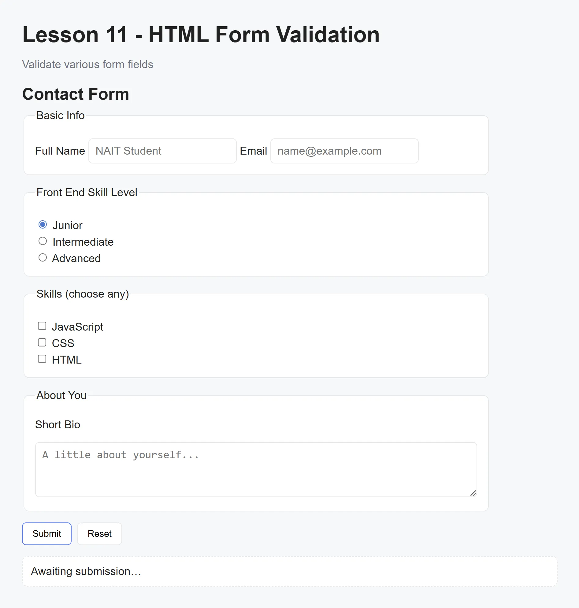
Section titled “Review updates to index.html - HTML 5 validation”The index.html file has been updated to make use of the default HTML 5 validation attributes. In this case, the required attribute has been added to the fullName and email inputs.
<fieldset> <legend>Basic Info</legend> <label> Full Name <input type="text" name="fullName" placeholder="NAIT Student" required> </label> <label> Email <input type="email" name="email" placeholder="name@example.com" required> </label></fieldset>If you try to submit the form as it is, with empty fleids, the browser will prevent submission and display browser formatted error messages (typically in a small tooltip-like popup). There are a number of additional attributes you can use to take advantage of the browser’s validation capabilities. You can read more about them on the MDN site here.
Add live validation on input events
Section titled “Add live validation on input events”form.addEventListener('input', (e) => { const target = e.target;
// fullName: require at least two words if (target.name === 'fullName') { const nameParts = target.value.trim().split(' '); if (nameParts.length < 2) { target.setCustomValidity('Full Name must contain at least two words.'); } else { target.setCustomValidity(''); } }
// bio: minimum length of 40 chars if (target.name === 'bio') { if (target.value.trim().length < 40) { target.setCustomValidity('Bio must be at least 40 characters long.'); } else { target.setCustomValidity(''); } }
// email: basic '@' check (optional: replace with regex) if (target.name === 'email') { if (!target.value.includes('@')) { target.setCustomValidity('Email must contain an "@" symbol.'); } else { target.setCustomValidity(''); } }
// Show the browser's validation message for the specific field target.reportValidity();});Check for valid inputs on form submission
Section titled “Check for valid inputs on form submission”form.addEventListener('submit', (e) => { e.preventDefault();
const data = serializeForm(form);
if (form.checkValidity()) { result.textContent = ` Submission received: - Name: ${data.fullName} - Email: ${data.email} - Bio: ${data.bio} - Plan: ${data.plan} - Topics: ${data.topics} `;});Student exercise
Section titled “Student exercise”Implement a novalidate flow with custom UI
- Update the
<form>inindex.htmlto include thenovalidateattribute to disable the browser’s default popups. - Create a small custom UI for field errors (for example, a
<div class="error" data-for="fieldName"></div>under each input). - Write a reusable validator function (or functions) that returns an error message when a field is invalid, or an empty string when valid.
- Call those validators from the
inputevent to show/hide the per-field error UI in real time, and call them again onsubmitto validate the submission flow. - On submit, if all validators pass, show a success message in the
resultarea; otherwise, set focus on the first invalid field.
Hints
- Use
document.querySelector('<error-selector>')orelement.nextElementSiblingto find the error container for a field. - Keep the UI simple. Show a red message under the input and add an
.invalidclass to the input when there’s an error. - Try empty required fields, too-short bios, and malformed emails to confirm your custom messages appear.
Acceptance criteria
Section titled “Acceptance criteria”- The browser’s native popups are disabled (via
novalidate) and all validation messages are shown in your custom UI. - Validation runs on both
input(live feedback) andsubmit(final check). - Your validators are small and reusable (same code can be used from both places).
Push to your GitHub workbook repo
Section titled “Push to your GitHub workbook repo”Once you’re done making your own custom updates to the project, stage your files, commit your work, and push to the remote repository.
- Open a terminal in VS Code
- Stage all updated and created files:
git add .- Commit the changes:
git commit -m 'Lesson 11 Example'- Push your changes to the remote workbook repository:
git push origin mainTODO: Lesson Refinements
Section titled “TODO: Lesson Refinements”
TODO: Lesson Refinements
Section titled “TODO: Lesson Refinements”- Validate using the form’s
'change'event instead of'input'(that way, validation isn’t on every keystroke) - Use the form’s
'input'event to clear the custom validity